Here please suggest how the menu structure should be
a) organized (which menuitem under which)
b) looked (what the user should see on a specific form/"scene")
NOT including the unit selection forms/dialogs (eg. selecting unit/tech for production/later same for mapeditor)
Unity version menu ideas
-
Stratego (dev)
- Site Admin
- Posts: 15741
- Joined: Fri Apr 25, 2014 9:28 pm
-
makazuwr32

- Posts: 7830
- Joined: Tue Oct 17, 2017 9:29 am
- Location: Moscow, Russia
Re: Unit version menu ideas
I would like to move map editor from "others" menu to main menu part.
AoF Dev Co-Leadermakazuwr32 wrote: ↑Mon Sep 16, 2019 7:54 amWhen you ask to change something argument why...
Put some numbers, compare to what other races have and so on...
© by Makazuwr32™.

-
Stratego (dev)
- Site Admin
- Posts: 15741
- Joined: Fri Apr 25, 2014 9:28 pm
Re: Unit version menu ideas
why? that is a "secondary" feature - not a mainstream thingie.
-
Stratego (dev)
- Site Admin
- Posts: 15741
- Joined: Fri Apr 25, 2014 9:28 pm
Re: Unit version menu ideas
also dont think the meanu like now - a list of buttons - but a visual/graphical something - i need ideas for those screens and alignments.
-
makazuwr32
- Posts: 7830
- Joined: Tue Oct 17, 2017 9:29 am
- Location: Moscow, Russia
Re: Unit version menu ideas
Can't give any advice about that as person who thinks that visuals are not requirement for good game. For me current menu is already good. Only if map editor access was simplier and closer it would become for me better.
Only advice that i can give is that maybe making a part of screen to the left or to the right to be used for showing info about unit (basic stats, effects on unit, its abilities... something like that, so everything is in single place. Other functional buttons will be put above that information of unit (something like hud in warcraft 2)...).
Can't say anything about visuals but functionality wise i would like that way more.
Here is an example that i mean:
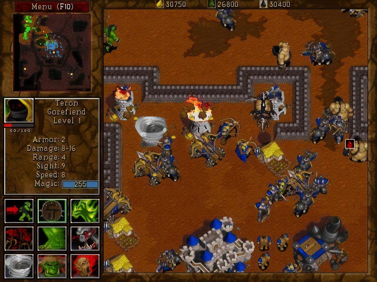
On the left of screen there is hud.
Top left of hud is used for mini map (right... addition of minimap in match itself also will be useful).
Middle part iz used for displaying information about unit — name, level (or how many techs is it affected by, specifically in that game), stats of unit. Here can we also add short list of effects unit has on it.
Bottom left part is used for unit controls: attack, move, stop, stand ground, patrolling, attack target area (not on all units) and up to 6 unique to units' abilities' icons.
Only advice that i can give is that maybe making a part of screen to the left or to the right to be used for showing info about unit (basic stats, effects on unit, its abilities... something like that, so everything is in single place. Other functional buttons will be put above that information of unit (something like hud in warcraft 2)...).
Can't say anything about visuals but functionality wise i would like that way more.
Here is an example that i mean:
On the left of screen there is hud.
Top left of hud is used for mini map (right... addition of minimap in match itself also will be useful).
Middle part iz used for displaying information about unit — name, level (or how many techs is it affected by, specifically in that game), stats of unit. Here can we also add short list of effects unit has on it.
Bottom left part is used for unit controls: attack, move, stop, stand ground, patrolling, attack target area (not on all units) and up to 6 unique to units' abilities' icons.
AoF Dev Co-Leadermakazuwr32 wrote: ↑Mon Sep 16, 2019 7:54 amWhen you ask to change something argument why...
Put some numbers, compare to what other races have and so on...
© by Makazuwr32™.
-
Stratego (dev)
- Site Admin
- Posts: 15741
- Joined: Fri Apr 25, 2014 9:28 pm
Re: Unit version menu ideas
thanks, but this topic is bout the out-game menu (not the in-game hud)
- i have not opened about in game hud as i thought a similar to current is nice enough.
- i have not opened about in game hud as i thought a similar to current is nice enough.
-
MaharajaInfernape
- Posts: 89
- Joined: Fri May 14, 2021 1:18 pm
Re: Unit version menu ideas
My opinion is the following:
- There will be a nice background picture.
- The Play button will be in a different style and larger than other buttons.
- The menus will be not like lists but like grid.
-
Stratego (dev)
- Site Admin
- Posts: 15741
- Joined: Fri Apr 25, 2014 9:28 pm
Re: Unit version menu ideas
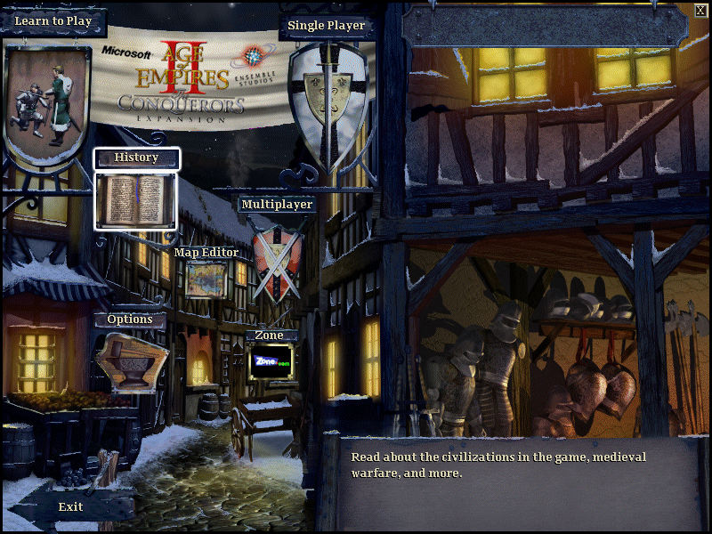
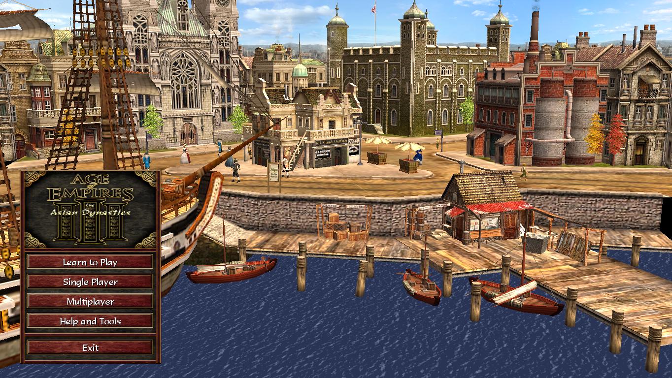
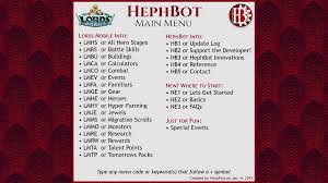
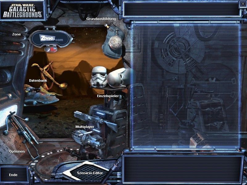
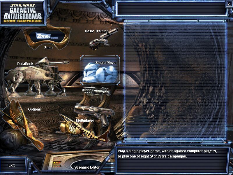
ok, but i think better to make some sketches or screenshots from games, the best srategy game ever has this main "menu"
-
Stratego (dev)
- Site Admin
- Posts: 15741
- Joined: Fri Apr 25, 2014 9:28 pm
Re: Unit version menu ideas
however a newer version of it is more like a standard menu-butoon list
-
Stratego (dev)
- Site Admin
- Posts: 15741
- Joined: Fri Apr 25, 2014 9:28 pm


-
Stratego (dev)
- Site Admin
- Posts: 15741
- Joined: Fri Apr 25, 2014 9:28 pm
Re: Unit version menu ideas
actually as i see they all have textual menus - not some graphics like the old AOK
-
MaharajaInfernape
- Posts: 89
- Joined: Fri May 14, 2021 1:18 pm
Re: Unit version menu ideas
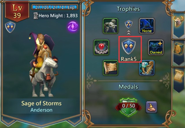
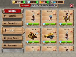
My suggestion is this type of menu.
-
Hyuhjhih

- Posts: 1301
- Joined: Sat Sep 19, 2020 4:22 am
- Location: Earth, (the part of blue ball and is named India for some reasons)
Re: Unit version menu ideas
Cool!!!
The one which first came in my mind is
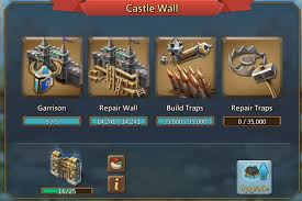
From one of my fav, lords mobile
 the main menu layout
The stat sheet modifications like,
 under titles in order single player
Multi player
skirmish
market
Map editor
Main menu
And progress bar green showing XP and level and blue showing how many active matches ongoing under each section
The map setup as
The map preview, tc placement, setup, and the time limit(in the space provided by the icon) so no more confusion.
 quick view techs.
Upgrades/style(but keeping the incentive shadows )
)
Chats structure may impress new players
Like giving players new colors, showing a max 6 chats a time on screen, and involving scrolling to a max 50(as currently), reduced font size.
These are just my concepts. It all can vary greatly.
The one which first came in my mind is
From one of my fav, lords mobile
the main menu layout The stat sheet modifications like,
Multi player
skirmish
market
Map editor
Main menu
And progress bar green showing XP and level and blue showing how many active matches ongoing under each section
The map setup as
The map preview, tc placement, setup, and the time limit(in the space provided by the icon) so no more confusion.
Upgrades/style(but keeping the incentive shadows
Chats structure may impress new players
Like giving players new colors, showing a max 6 chats a time on screen, and involving scrolling to a max 50(as currently), reduced font size.
These are just my concepts. It all can vary greatly.
LIE = Love Is Eternal.
Design leader of the variants Age of Gods and Age Of Civilization, and live heartedly contributing to AoS.
AoC discord server is up AoC
Design leader of the variants Age of Gods and Age Of Civilization, and live heartedly contributing to AoS.
AoC discord server is up AoC
-
makazuwr32
- Posts: 7830
- Joined: Tue Oct 17, 2017 9:29 am
- Location: Moscow, Russia
Re: Unit version menu ideas
Do not like such colorful and too heavy looking style.
Too many unrequired things.
I prefer a bit more minimalistic style for menu, without icons or at least with not that big icons.
This one is also looks enough for me alas it could not fit for our game:

Too many unrequired things.
I prefer a bit more minimalistic style for menu, without icons or at least with not that big icons.
This one is also looks enough for me alas it could not fit for our game:
AoF Dev Co-Leadermakazuwr32 wrote: ↑Mon Sep 16, 2019 7:54 amWhen you ask to change something argument why...
Put some numbers, compare to what other races have and so on...
© by Makazuwr32™.
-
MaharajaInfernape
- Posts: 89
- Joined: Fri May 14, 2021 1:18 pm
Re: Unit version menu ideas
This
 one looks good, at least much better than the current AoS menu, but worse than this
 .
.
-
Hyuhjhih
- Posts: 1301
- Joined: Sat Sep 19, 2020 4:22 am
- Location: Earth, (the part of blue ball and is named India for some reasons)
Re: Unit version menu ideas
Ah.. don't bother with the content, i was refering the layout,makazuwr32 wrote: ↑Sat May 22, 2021 7:39 am Do not like such colorful and too heavy looking style.
Too many unrequired things.
I prefer a bit more minimalistic style for menu, without icons or at least with not that big icons.
This one is also looks enough for me alas it could not fit for our game
This makes it less confusing, can include several factors
Like account, search players, leaderboards,settings, unit list, upgrades, languages, chats, forum, help, version log, achievements, play button, ..... all at one place,
Its all matter of course and float. Btw, it is better done with unity's visual scripting system i hope.
LIE = Love Is Eternal.
Design leader of the variants Age of Gods and Age Of Civilization, and live heartedly contributing to AoS.
AoC discord server is up AoC
Design leader of the variants Age of Gods and Age Of Civilization, and live heartedly contributing to AoS.
AoC discord server is up AoC
-
Stratego (dev)
- Site Admin
- Posts: 15741
- Joined: Fri Apr 25, 2014 9:28 pm
Re: Unity version menu ideas
new example image
another
another
Re: Unity version menu ideas
Menu idea which I think many players will agree with me.
One - restart button on in game for singleplayer and campaigns. It is a pain when I have to quit then click click to restart the game. Many games already have this.
Two - test game option in Map editor. Like restart button. I have to specifically quit the map, activate it before I can play it. A button that I could click which could bring me to the game after editing it would be nice.
Re: Unity version menu ideas
I agree with both. Not absolutely required, but would be some very good QoL improvements.DreJaDe wrote: ↑Thu Mar 24, 2022 2:02 am Menu idea which I think many players will agree with me.
One - restart button on in game for singleplayer and campaigns. It is a pain when I have to quit then click click to restart the game. Many games already have this.
Two - test game option in Map editor. Like restart button. I have to specifically quit the map, activate it before I can play it. A button that I could click which could bring me to the game after editing it would be nice.
Green is the correct color, other colors are "less correct".
-
Stratego (dev)
- Site Admin
- Posts: 15741
- Joined: Fri Apr 25, 2014 9:28 pm
Re: Unity version menu ideas
I see but in this topic i search for ideas on the viasual appearance of the main menu.
not functionality of buttons.
thanks!
not functionality of buttons.
thanks!
Re: Unity version menu ideas
HmmStratego (dev) wrote: ↑Thu Mar 24, 2022 6:41 am I see but in this topic i search for ideas on the visual appearance of the main menu.
not functionality of buttons.
thanks!
So do I need to suggest again somewhere?
This is the best topic I could see related to knowing that the game is already transitioning into unity
-
Stratego (dev)
- Site Admin
- Posts: 15741
- Joined: Fri Apr 25, 2014 9:28 pm
Re: Unity version menu ideas
i made now a "others" section under unity workbench.
please post there - thanks!
please post there - thanks!
-
Stratego (dev)
- Site Admin
- Posts: 15741
- Joined: Fri Apr 25, 2014 9:28 pm
Re: Unity version menu ideas
ok,
i am here to making this view.
any suggestions whih way is preferred?
there were above some ideas.
or if u have different idea please tell me.
i also found this (big image background and simple textual menu on the side
http://oilrush-game.com/static/img/scre ... ush_55.jpg

i am here to making this view.
any suggestions whih way is preferred?
there were above some ideas.
or if u have different idea please tell me.
i also found this (big image background and simple textual menu on the side
http://oilrush-game.com/static/img/scre ... ush_55.jpg
Re: Unity version menu ideas
Well, I kinda like the current visual... But if you want to make it fancier, it could be structured somewhat like in that image (though probably with a bigger menu window for mobile), and with a collection of pics from the game cycling in the background... not sure if that would look good on mobile though. Just an idea.
Green is the correct color, other colors are "less correct".
-
Stratego (dev)
- Site Admin
- Posts: 15741
- Joined: Fri Apr 25, 2014 9:28 pm
Re: Unity version menu ideas
"current visual"
you mean the android version? or the current unity version?(if u happened to see)
you mean the android version? or the current unity version?(if u happened to see)
Re: Unity version menu ideas
I meant in the current android version. I don't remember seeing it in Unity version yet.
Green is the correct color, other colors are "less correct".